STA 303H1S / 1002HS -- Methods of Data Analysis II
-- Winter 2013
SAS examples from lecture:
The Spock Conspiracy Trial (One-way analysis of variance)
Data (text, csv)
SAS code (text)
SAS output (.lst) (text)
I discovered that some of the output was missing. This has been fixed (Janary 21 at 10:55 p.m.).
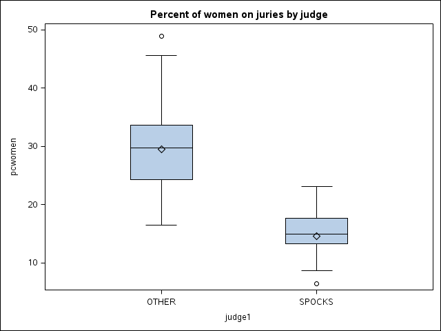
Plot from first PROC SGPLOT (Spock's judge versus all other judges):
Side-by-side boxplots for Spock's judges and the other 6 judges (png)
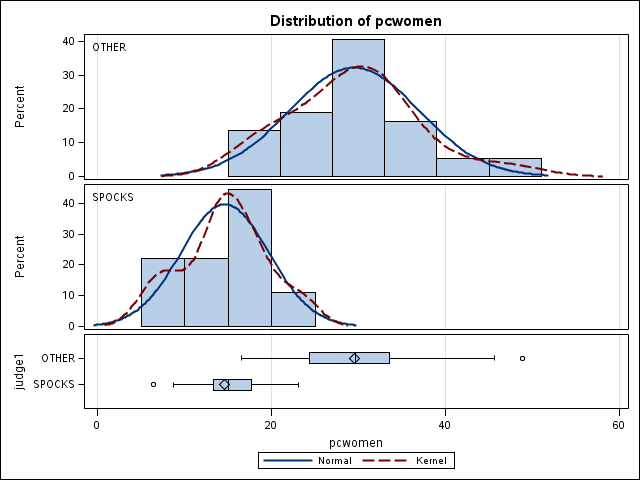
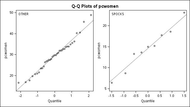
Plots from PROC TTEST:
Summary panel: histograms and boxplots (png)
Normal quantile plots (png)
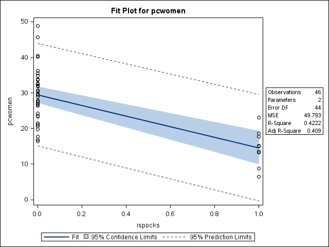
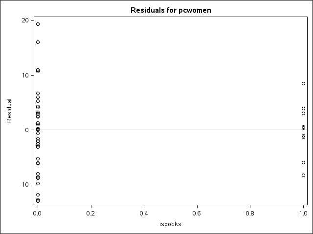
Plots from first PROC REG (Spock's judge versus all other judges):
Fitted "line" and confidence interval and prediction interval (png)
Diagnostics panel (png)
Residuals versus explanatory variable (png)
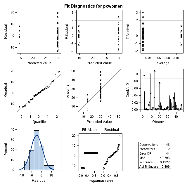
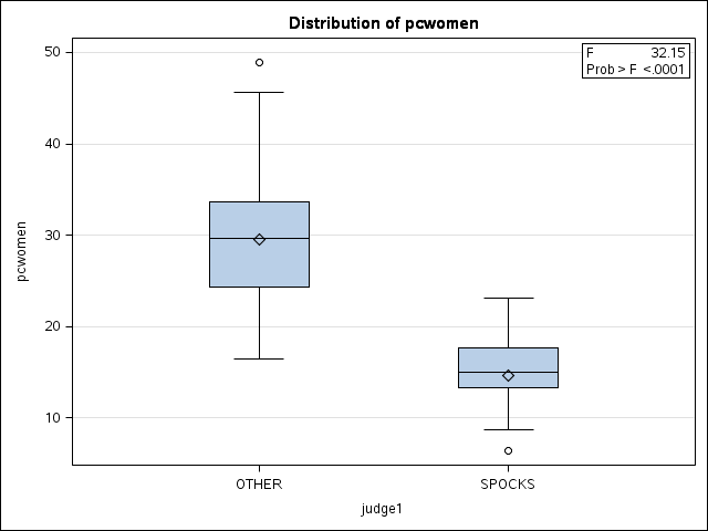
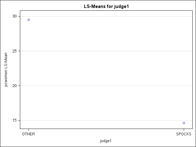
Plots from first PROC GLM (Spock's judge versus all other judges):
Side-by-side boxplots (png)
Diagnostics panel (png)
Mean plot from lsmeans statement (png)
"DiffPlot" (diffogram) from lsmeans statement with pdiff option (png)
Plot from second PROC SGPLOT (comparing all judges other than Spock's):
Side-by-side boxplots for the other 6 judges (png)
Plots from second PROC REG (comparing all judges other than Spock's):
Diagnostics panel (png)
Residuals versus explanatory variables (png)
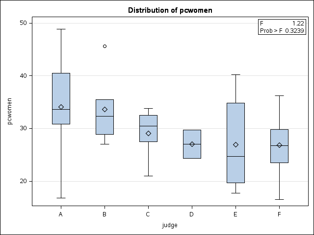
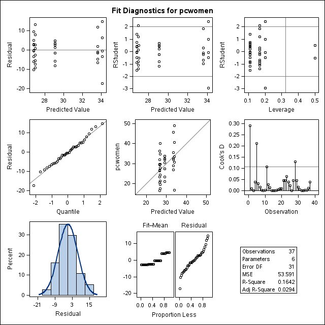
Plots from second PROC GLM (comparing all judges other than Spock's):
Side-by-side boxplots (png)
Diagnostics panel (png)
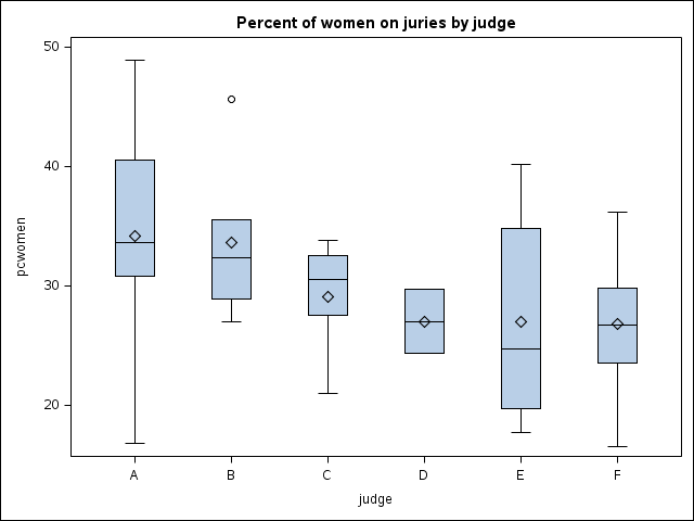
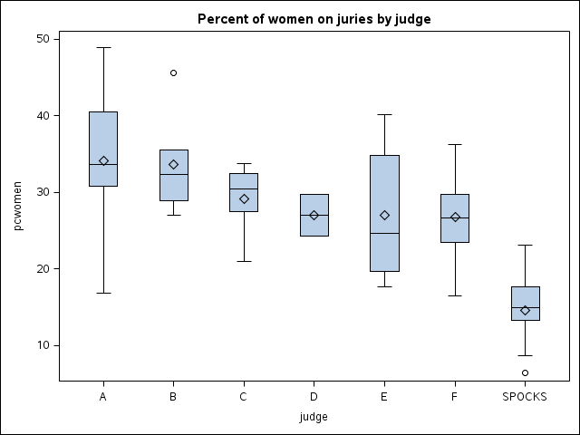
Plot from third PROC SGPLOT (comparing all 7 judges):
Side-by-side boxplots for the all 7 judges (png)
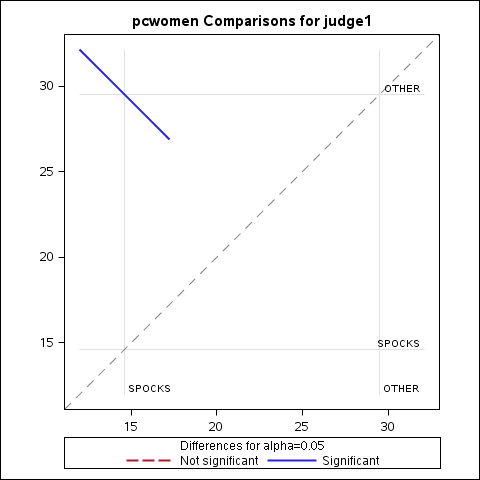
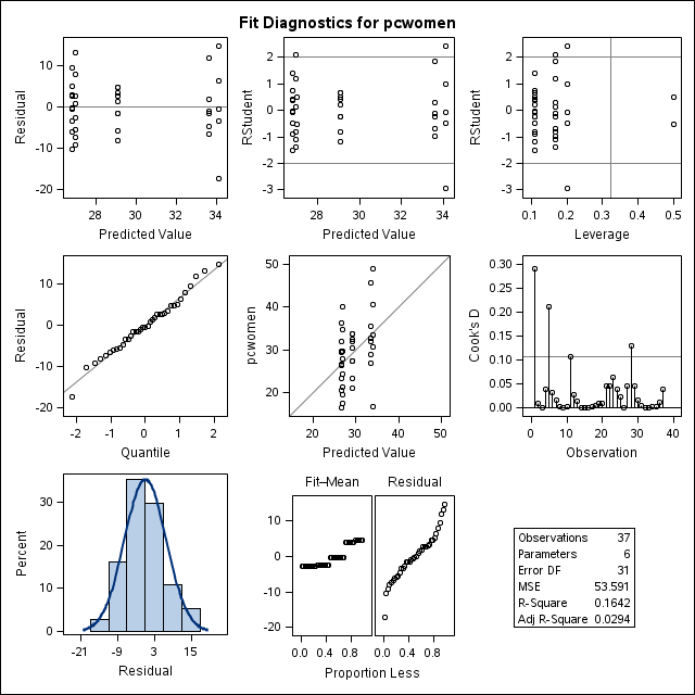
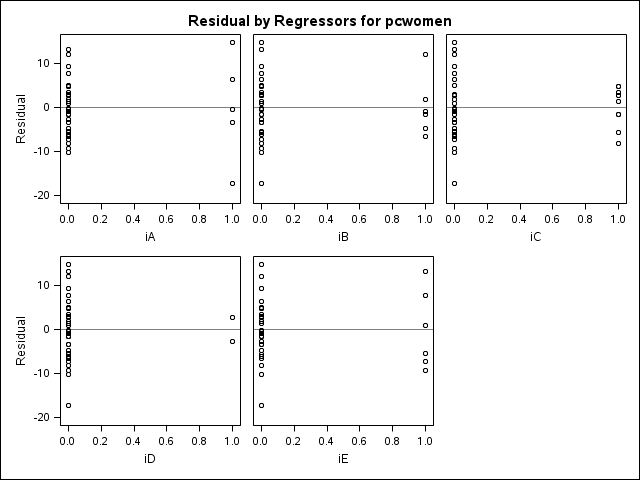
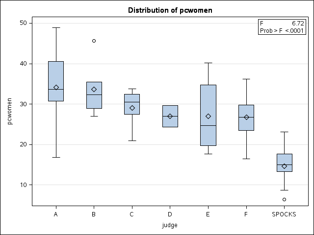
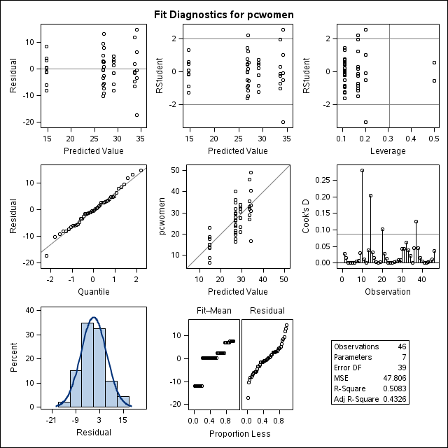
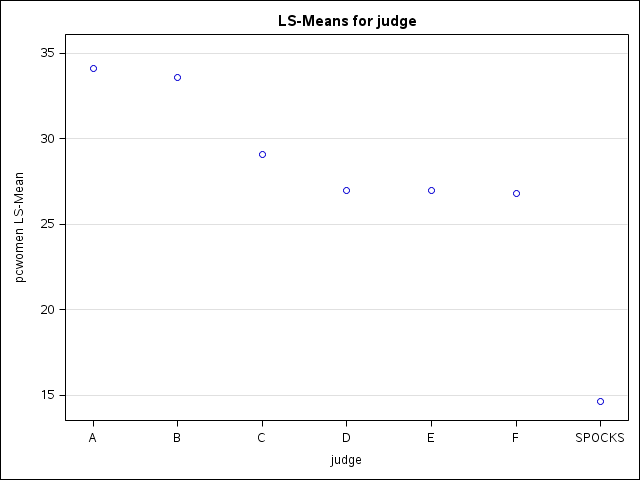
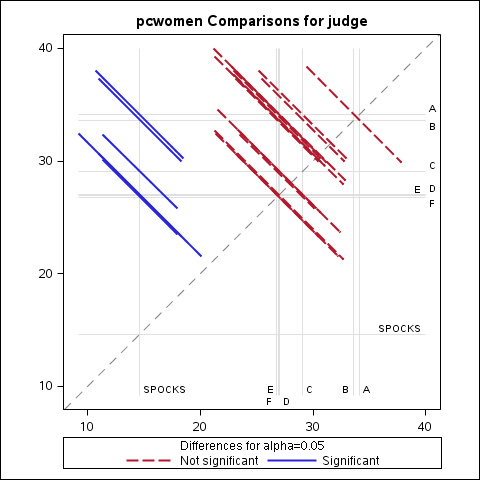
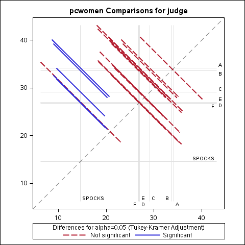
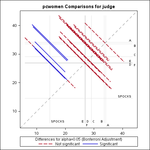
Plots from third PROC GLM (comparing all 7 judges):
Side-by-side boxplots (png)
Diagnostics panel (png)
Mean plot from lsmeans statement (png)
"DiffPlot" (diffogram) from lsmeans statement with pdiff option and no adjustment (png)
"DiffPlot" (diffogram) from lsmeans statement with pdiff option and Tukey adjustment (png)
"DiffPlot" (diffogram) from lsmeans statement with pdiff option and Bonferroni adjustment (png)
Mercury Levels in Fish in Maine: (Two-way analysis of variance) HERE
Data (text, space delimited)
SAS code (text)
SAS output (.lst) (text)
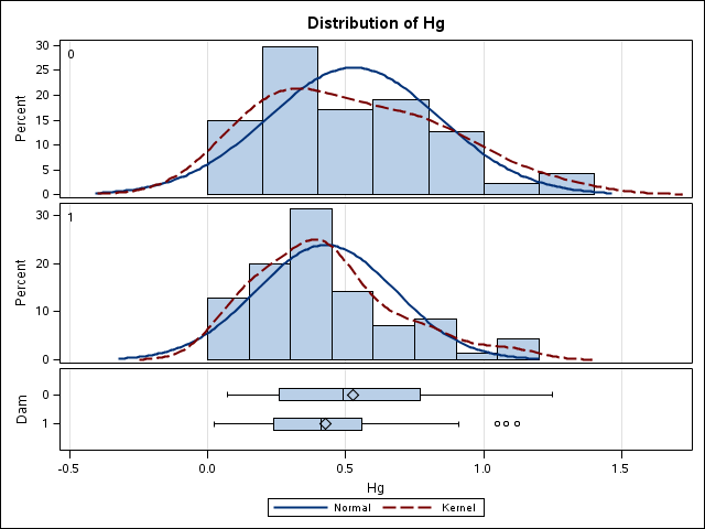
Boxplots:
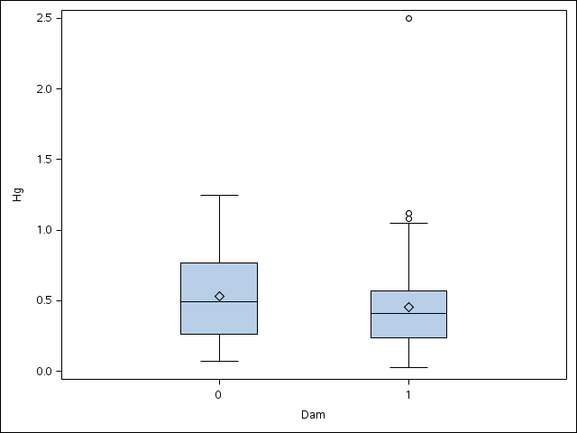
Boxplots of mercury level by dam status from PROC SGPLOT (png)
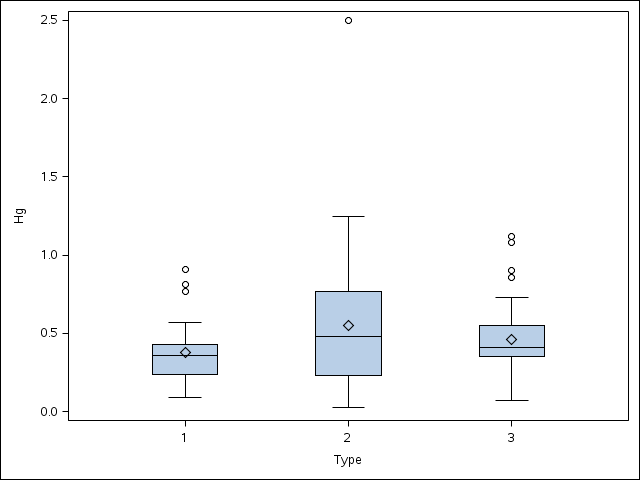
Boxplots of mercury level by lake type from PROC SGPLOT (png)
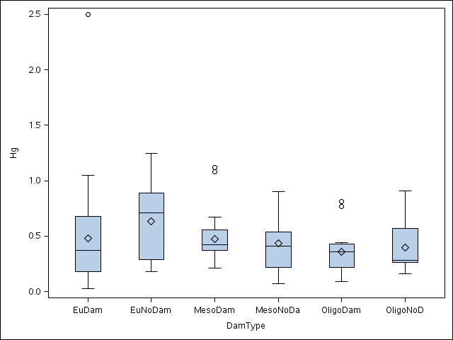
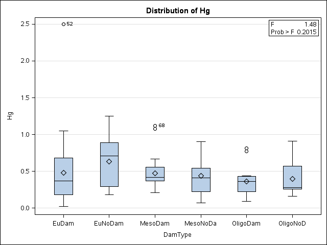
Boxplots of mercury level by dam status and lake type from PROC SGPLOT (png)
Boxplots of mercury level by dam status and lake type from PROC GLM (png)
Interaction plots:
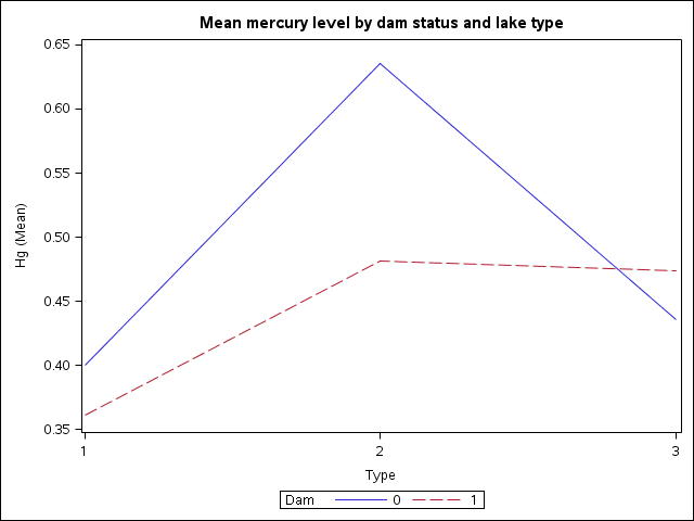
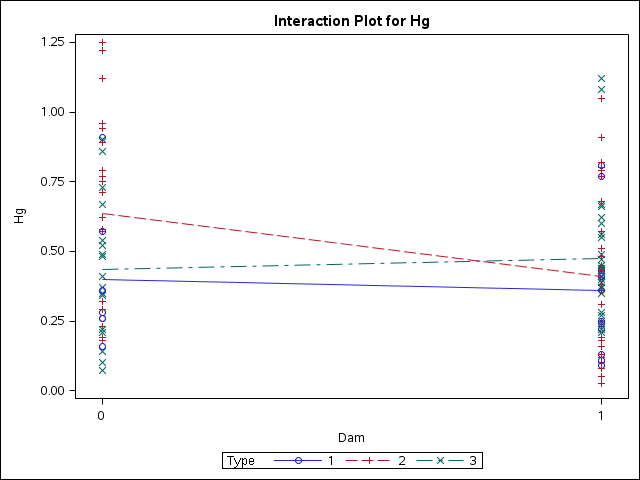
Interaction plot using full data from PROC SGPLOT
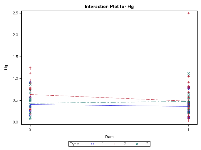
Interaction plot using full data from PROC GLM for model with interaction term
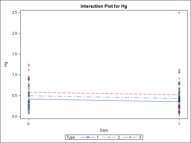
Interaction plot using full data from PROC GLM for additive model
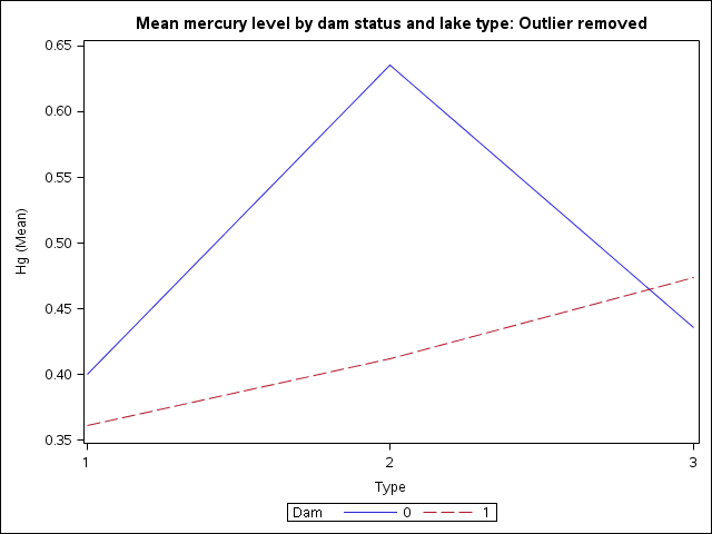
Interaction plot using data with outlier removed from PROC SGPLOT
Interaction plot using data with outlier removed from PROC GLM
Diagnostic plots:
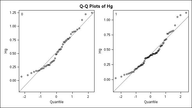
Normal quantile plot for t-test using full data
Summary panel for t-test using full data
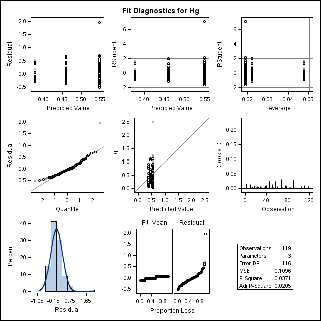
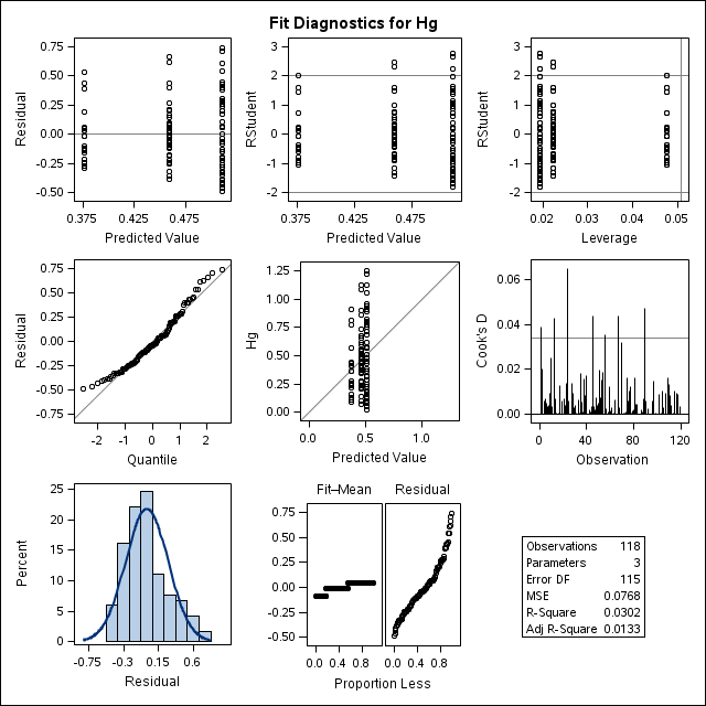
Diagnostics panel for one-way ANOVA by type using full data
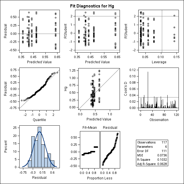
Diagnostics panel for one-way ANOVA by dam and type using full data
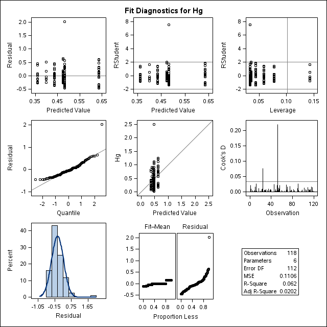
Diagnostics panel for two-way ANOVA with interaction using full data
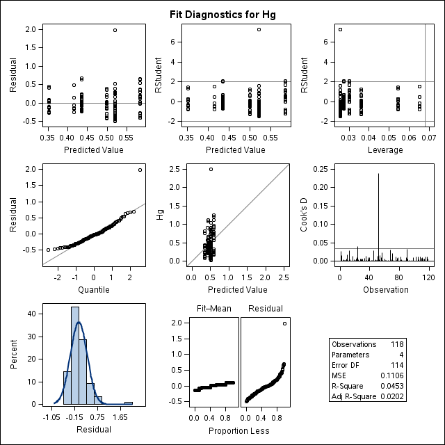
Diagnostics panel for two-way ANOVA without interaction using full data
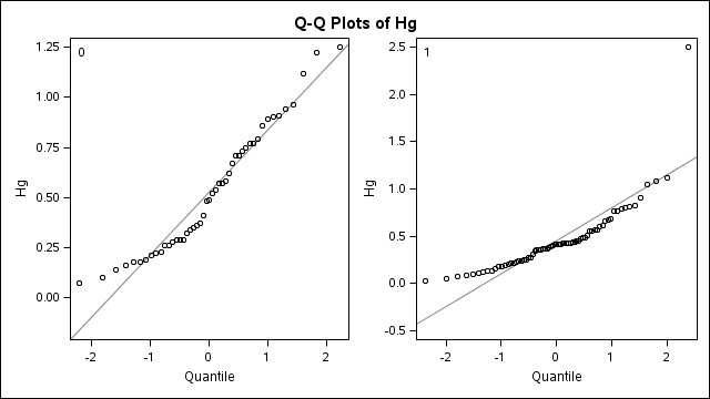
Normal quantile plot for t-test without outlier
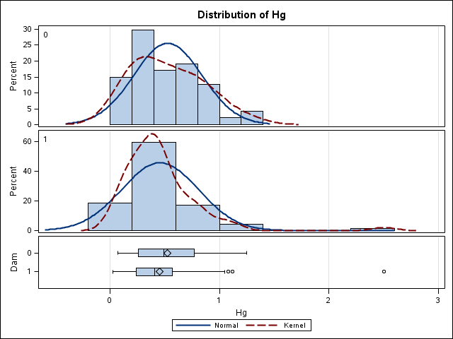
Summary panel for t-test without outlier
Diagnostics panel for one-way ANOVA by type without outlier
Diagnostics panel for one-way ANOVA by dam and type without outlier
Diagnostics panel for two-way ANOVA without outlier
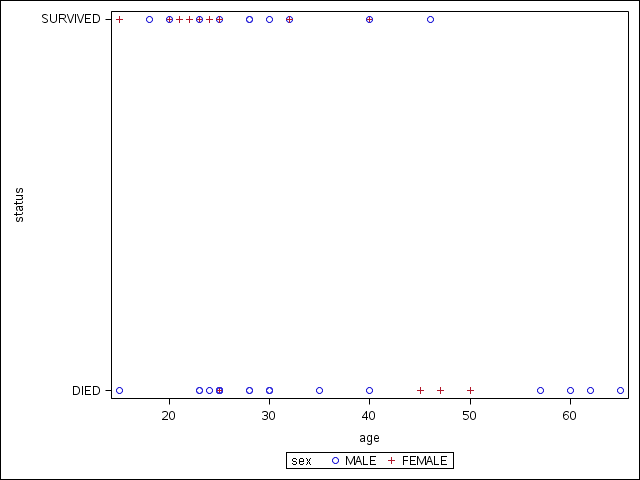
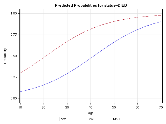
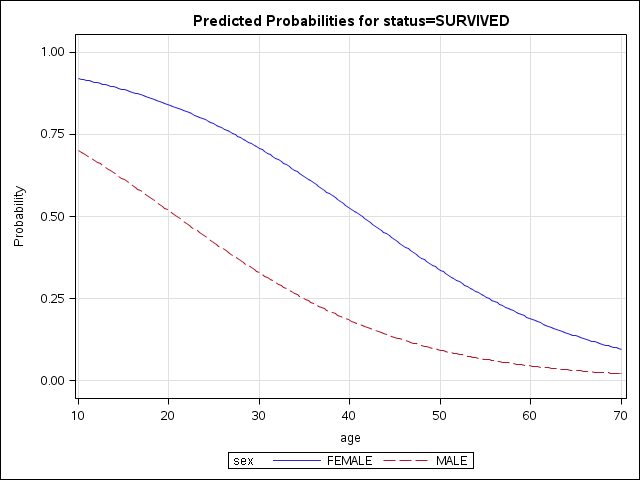
Donner Party (Logistic Regression with Binary Response)
Data (text, csv)
SAS code
SAS output
Plot of data (from proc sgplot)
Plot of predicted probabilities from first logistic model (modelling P(DIED)
Plot of predicted probabilities from second logistic model (modelling P(SURVIVED)
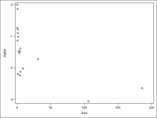
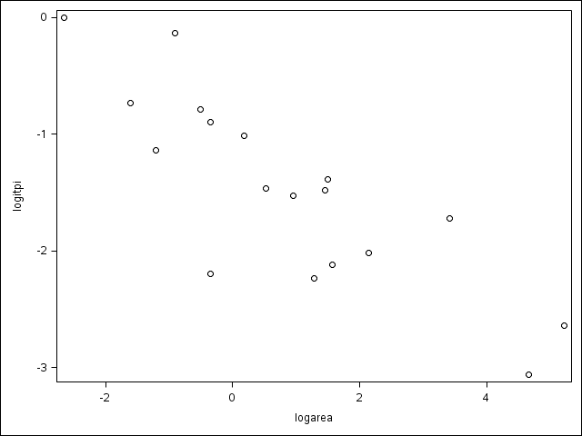
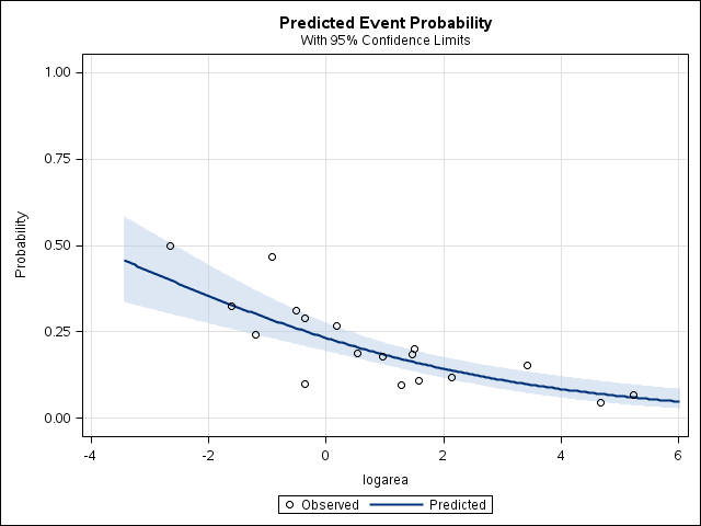
Krunnit (Logistic Regression with Binomial Response)
Data (text, csv)
SAS code (text)
SAS output (text)
Plot of logit of response proportion versus area from first proc sgplot
Plot of logit of response proportion versus log of area from second proc sgplot
Plot of response proportion and model proportions (EffectPlot.png)
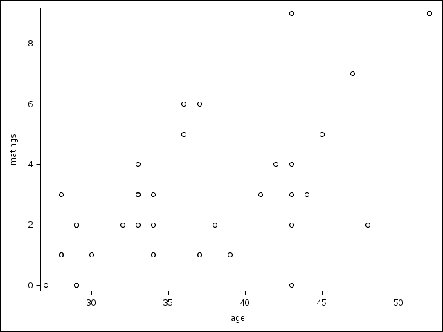
Elephants mating (Poisson regression)
Data (csv)
SAS code
Plot of number of matings versus age (png)
SAS output
Framingham longitudinal study (log-linear models)
SAS code
SAS output
Student drug use survey (log-linear models)
SAS code
SAS output
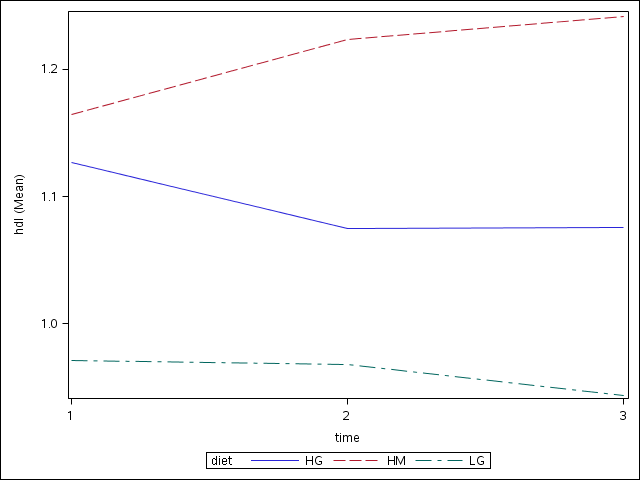
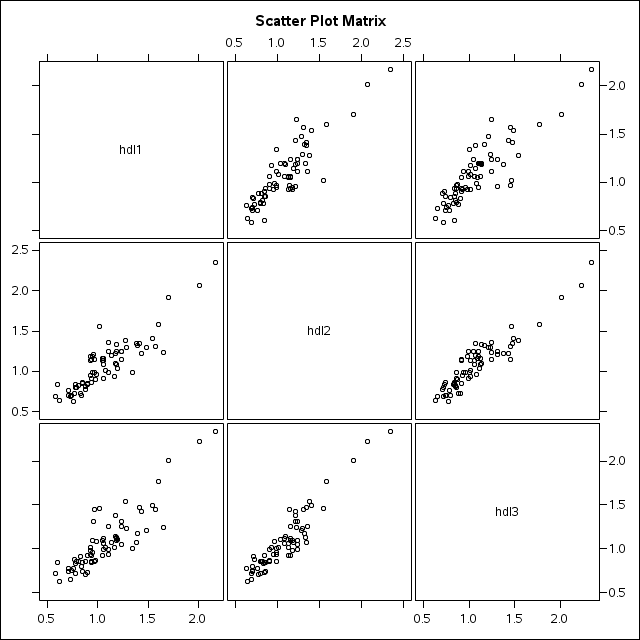
Effect of diet on cholesterol for diabetics (repeated measures)
Data (plain text)
SAS code
SAS output
Interaction plot (png)
Pairwise scatterplots for each pair of times (all observations (png)
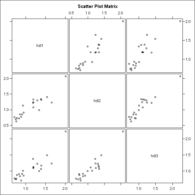
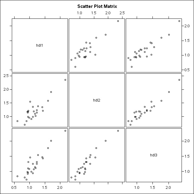
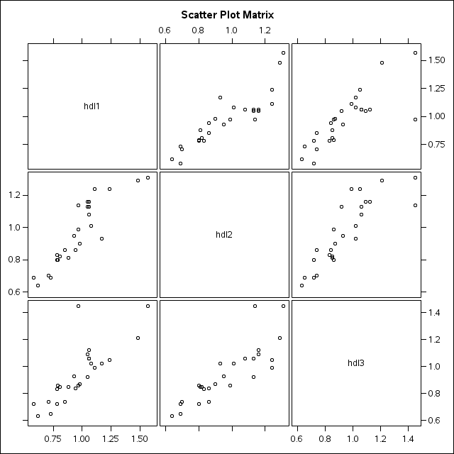
Pairwise scatterplots for each pair of times for each diet:
Diet HG (png)
Diet HM (png)
Diet LG (png)
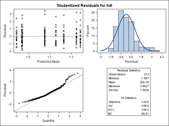
Panel of studentized conditional residuals (png)